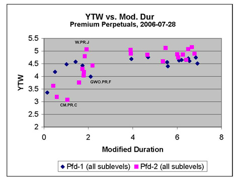
Another yield curve for your edification and amusement!

This one is similar in nature to Operating Retractibles yield curve discussed a few days ago, but does have some unique points of interest.
There’s a lot of scatter – more scatter than there really should be, given that the average volume traded is so much greater than the equivalent number for the constituents of the OpRet index. And, one should note, I didn’t plot a point for RY.PR.S, which has a Modified Duration of the YTW scenario of 0.16 Years, and a YTW of -1.82%.
The CM.PR.C and GWO.PR.F look rather expensive, don’t they? I certainly can’t figure out … the CM.PR.C looked good a little while ago, when they were trading in the neighborhood of $26.50 – I can’t say I’m so impressed with them nowadays, closing 7/31 with a quote of 26.76-87.
But the most strange thing by far about this curve is that, while the lower quality credits look to be at a more or less decent spread to their higher-rated peers at the long end (well … relatively long end, anyway!), they seem to be trading through them at the short end, and not by just a little bit. Which would seem to indicate some opportunity for arbitrage …
What this graph does not, and cannot, convey is the degree of risk implicit in the fact that these are perpetuals … once market prices start to change, the position of each data point on this graph might change substantially – which is why HIMIPref has such concepts as ‘Portfolio Yield’ and ‘Option Doubt’. But as a first approximation, some of the anomalies shown by this plot look pretty juicy, don’t they?
[…] Investors can do better. A look at the chart Premium-Perpetual Yield Curve, 2006-07-28 shows that there are plenty of alternatives. […]