Turnover remained fairly constant in December, at about 27%.
Trades were, as ever, triggered by a desire to exploit transient mispricing in the preferred share market (which may be thought of as “selling liquidity”), rather than any particular view being taken on market direction, sectoral performance or credit anticipation.
| MAPF Sectoral Analysis 2010-12-31 | |||
| HIMI Indices Sector | Weighting | YTW | ModDur |
| Ratchet | 0% | N/A | N/A |
| FixFloat | 0% | N/A | N/A |
| Floater | 0% | N/A | N/A |
| OpRet | 0% | N/A | N/A |
| SplitShare | 2.1% (-0.1) | 6.47% | 6.58 |
| Interest Rearing | 0% | N/A | N/A |
| PerpetualPremium | 8.7% (-10.2) | 5.82% | 10.50 |
| PerpetualDiscount | 72.3% (+7.2) | 5.60% | 14.54 |
| Fixed-Reset | 12.6% (+2.4) | 3.44% | 3.10 |
| Scraps (FixedReset) | 3.6% (0) | 6.90% | 12.62 |
| Cash | 0.7% (+0.5) | 0.00% | 0.00 |
| Total | 100% | 5.37% | 12.41 |
| Totals and changes will not add precisely due to rounding. Bracketted figures represent change from November month-end. Cash is included in totals with duration and yield both equal to zero. | |||
The “total” reflects the un-leveraged total portfolio (i.e., cash is included in the portfolio calculations and is deemed to have a duration and yield of 0.00.). MAPF will often have relatively large cash balances, both credit and debit, to facilitate trading. Figures presented in the table have been rounded to the indicated precision.
The increase in PerpetualDiscount holdings at the expense of PerpetualPremiums is largely due to migration of two positions, CM.PR.P and GWO.PR.M, from the latter class to the former. Both accrued dividends during the month.
Analysis of the data using the Straight Perpetual Implied Volatility Calculator produces the following table:
| Fits to Implied Volatility | ||||
| Issuer | 2010-12-31 | 2010-11-30 | ||
| Yield | Volatility | Yield | Volatility | |
| PWF | 4.75% | 21% | 4.45% | 25% |
| CM | 4.90% | 18% | 4.13% | 24% |
| GWO | 4.40% | 25% | 3.60% | 30% |
| Calculations are performed with a time horizon of three years for all issues | ||||
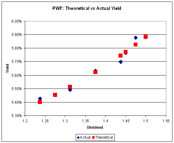
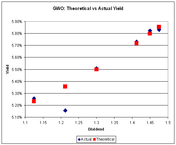
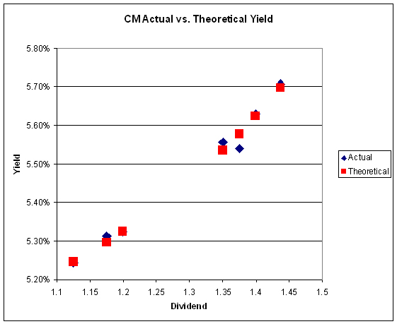
The decline in volatility is interesting and probably reflects a market view on the future direction of market yields. Given the high level of uninformed emotion in the preferred share market – particularly the Straight Preferred sector – this could be a fruitful area of research.
Graphs from the Straight Perpetual Volatility Calculator for December 31 are:
The yield pick-up for holding high-coupon Straights remains such that one should no longer automatically buy the deepest-discount issue in a series!
Credit distribution is:
| MAPF Credit Analysis 2010-12-31 | |
| DBRS Rating | Weighting |
| Pfd-1 | 0 (0) |
| Pfd-1(low) | 55.2% (+0.7) |
| Pfd-2(high) | 21.0% (-0.9) |
| Pfd-2 | 0 (0) |
| Pfd-2(low) | 19.6% (-0.3) |
| Pfd-3(high) | 3.6% (0) |
| Cash | 0.7% (+0.5) |
| Totals will not add precisely due to rounding. Bracketted figures represent change from November month-end. | |
Liquidity Distribution is:
| MAPF Liquidity Analysis 2010-12-31 | |
| Average Daily Trading | Weighting |
| <$50,000 | 0.0% (0) |
| $50,000 – $100,000 | 11.5% (-0.1) |
| $100,000 – $200,000 | 18.8% (-0.1) |
| $200,000 – $300,000 | 31.6% (+11.3) |
| >$300,000 | 37.4% (-11.7) |
| Cash | 0.7% (+0.5) |
| Totals will not add precisely due to rounding. Bracketted figures represent change from November month-end. | |
As was the case with the sector distribution, the large shift from the $300,000+ liquidity bucket to the $200,000-$300,000 was not due to trading, but rather to migration, as positions were held in BAM.PR.N, SLF.PR.B and YLO.PR.C which all experienced declines in Average Trading Value over the month.
MAPF is, of course, Malachite Aggressive Preferred Fund, a “unit trust” managed by Hymas Investment Management Inc. Further information and links to performance, audited financials and subscription information are available the fund’s web page. The fund may be purchased either directly from Hymas Investment Management or through a brokerage account at Odlum Brown Limited. A “unit trust” is like a regular mutual fund, but is sold by offering memorandum rather than prospectus. This is cheaper, but means subscription is restricted to “accredited investors” (as defined by the Ontario Securities Commission) or those who subscribe for $150,000+. Fund past performances are not a guarantee of future performance. You can lose money investing in MAPF or any other fund.
A similar portfolio composition analysis has been performed on the Claymore Preferred Share ETF (symbol CPD) as of August 31, 2010, and published in the September, 2010, PrefLetter. When comparing CPD and MAPF:
- MAPF credit quality is better
- MAPF liquidity is a higher
- MAPF Yield is higher
- Weightings in
- MAPF is much more exposed to Straight Perpetuals
- MAPF is much less exposed to Operating Retractibles
- MAPF is slightly more exposed to SplitShares
- MAPF is less exposed to FixFloat / Floater / Ratchet
- MAPF weighting in FixedResets is much lower


[…] PrefBlog Canadian Preferred Shares – Data and Discussion « MAPF Portfolio Composition: December 2010 […]