As noted in MAPF Portfolio Composition: January 2015, the fund now has a fairly large allocation to FixedResets, although this segment remains below index weight.
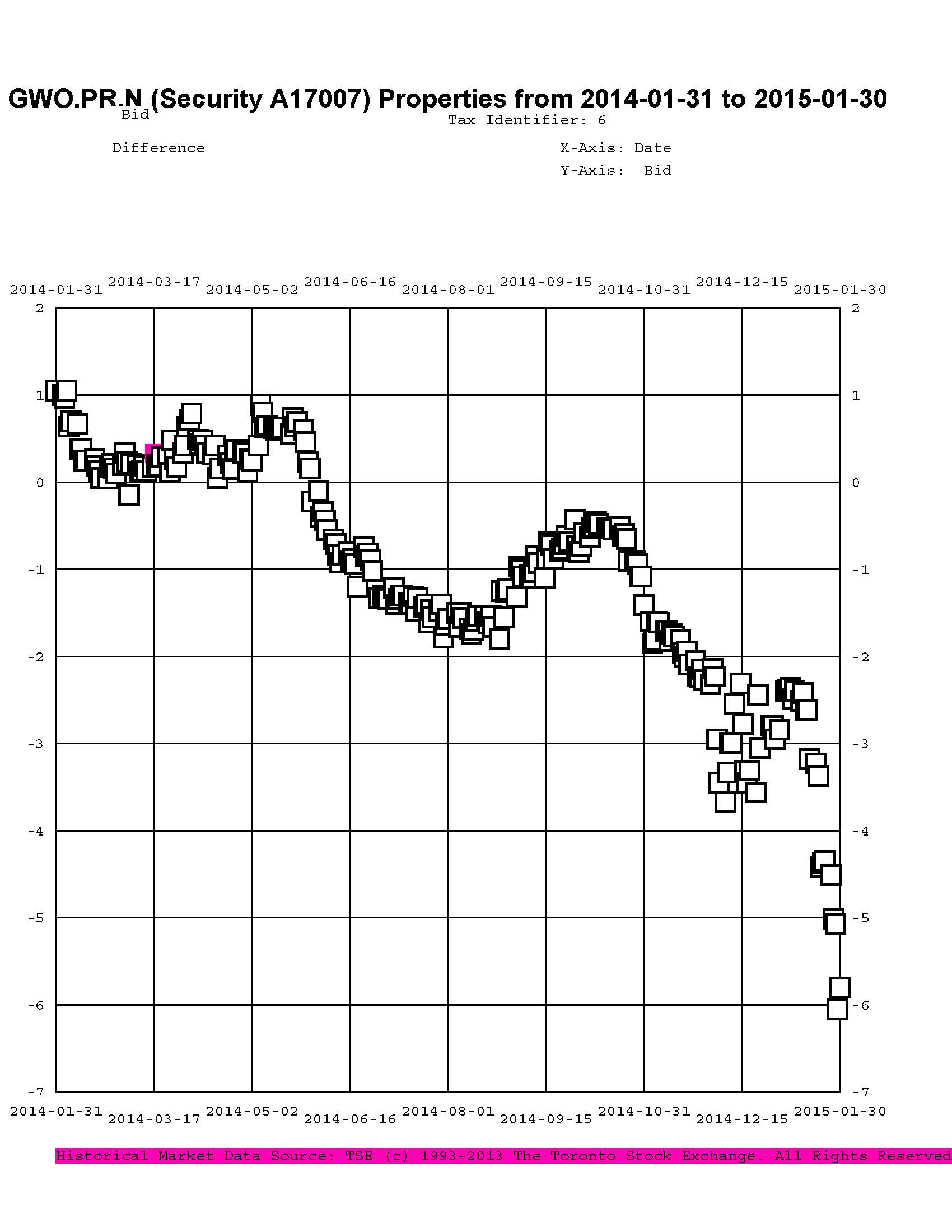
As these were largely purchased with proceeds of sales of DeemedRetractibles from the same issuer, it is interesting to look at the price trend of some of the Straight/FixedReset pairs. We’ll start with GWO.PR.N / GWO.PR.I; the fund sold the latter to buy the former at a takeout of about $1.00 in mid-June, 2014; relative prices over the past year are plotted as:
Click for Big
Given that the January month-end take-out was $5.80, this is clearly a trade that has not worked out very well.
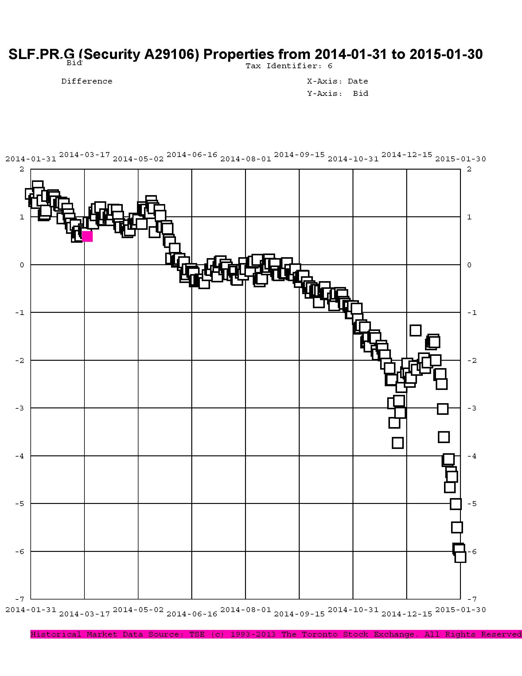
In July, 2014, I reported sales of SLF.PR.D to purchase SLF.PR.G at a take-out of about $0.15:
Click for Big
There were similar trades in August, 2014 (from SLF.PR.C) at a take-out of $0.35. The January month-end take-out (bid price SLF.PR.D less bid price SLF.PR.G) was $6.12, so that hasn’t worked very well either.
The trend paused in September, 2014 and, indeed, can be said to have reversed, with the fund selling SplitShares (PVS.PR.B at 25.25-30) to purchase PerpetualDiscounts (BAM.PR.M / BAM.PR.N at about 21.25), a trade which worked out favourably and has been sort-of reversed (into PVS.PR.D) in November 2014.
In October 2014 there was another bit of counterflow, as the fund sold more SplitShares (CGI.PR.D at about 25.25) to purchase more PerpetualDiscounts (CU.PR.F and CU.PR.G, at about 21.25) which again worked out well and was reversed in November, selling the CU issues at about 22.45 to purchase low-spread FixedResets (TRP.PR.A and TRP.PR.B) at about 21.50 and 18.75 (post dividend equivalent), which was basically down by transaction costs at November month-end, but a significant loser by December month-end.
And November saw the third insurer-based sector swap, as the fund sold MFC.PR.C to buy the FixedReset MFC.PR.F at a post-dividend-adjusted take-out of about $0.85 … given a month-end take-out of about $1.30, that’s another regrettable trade, although another piece executed in December at a take-out of $1.57 has done better.
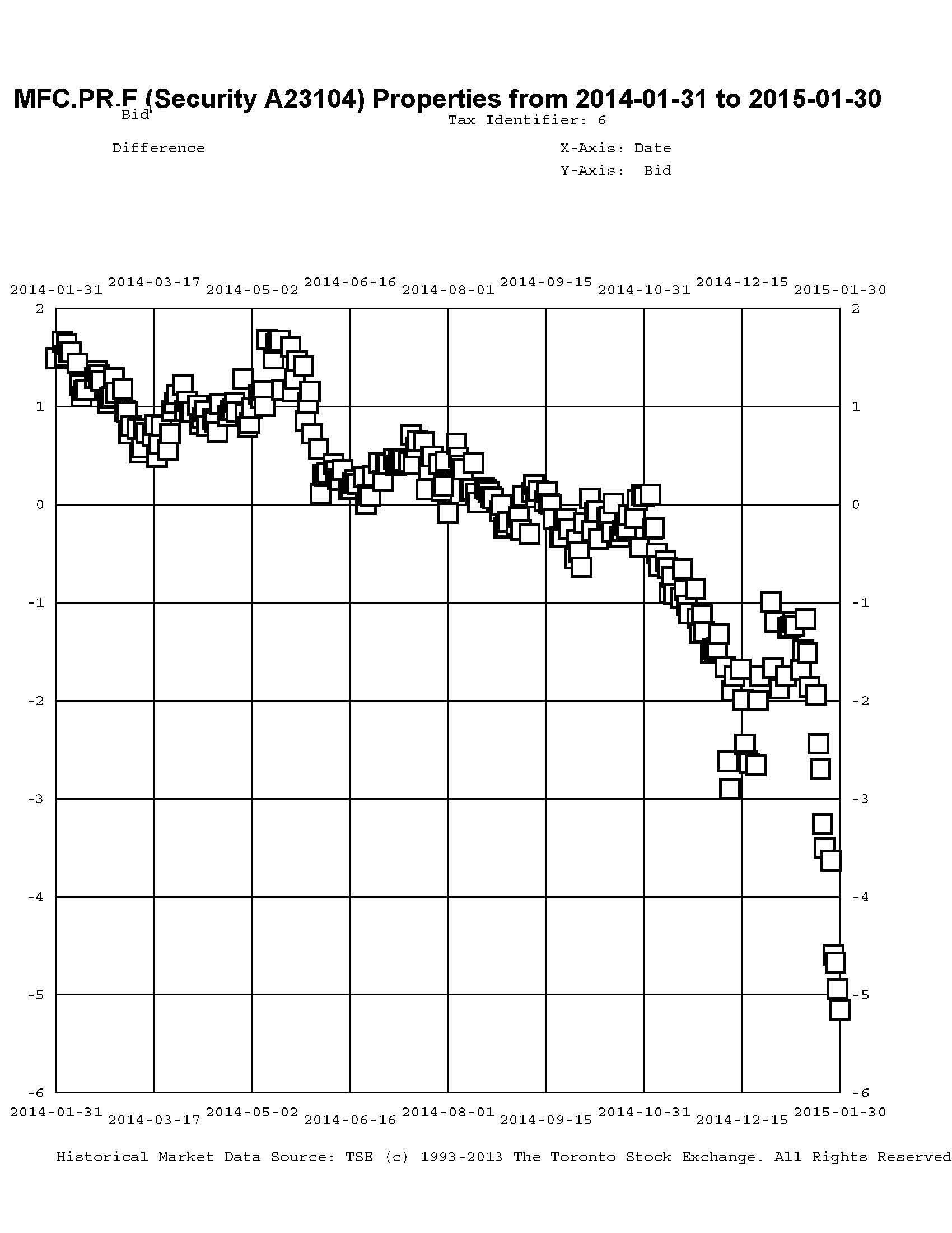
Click for Big
This trend is not restricted to the insurance sector. Other pairs of interest are BAM.PR.X / BAM.PR.N:
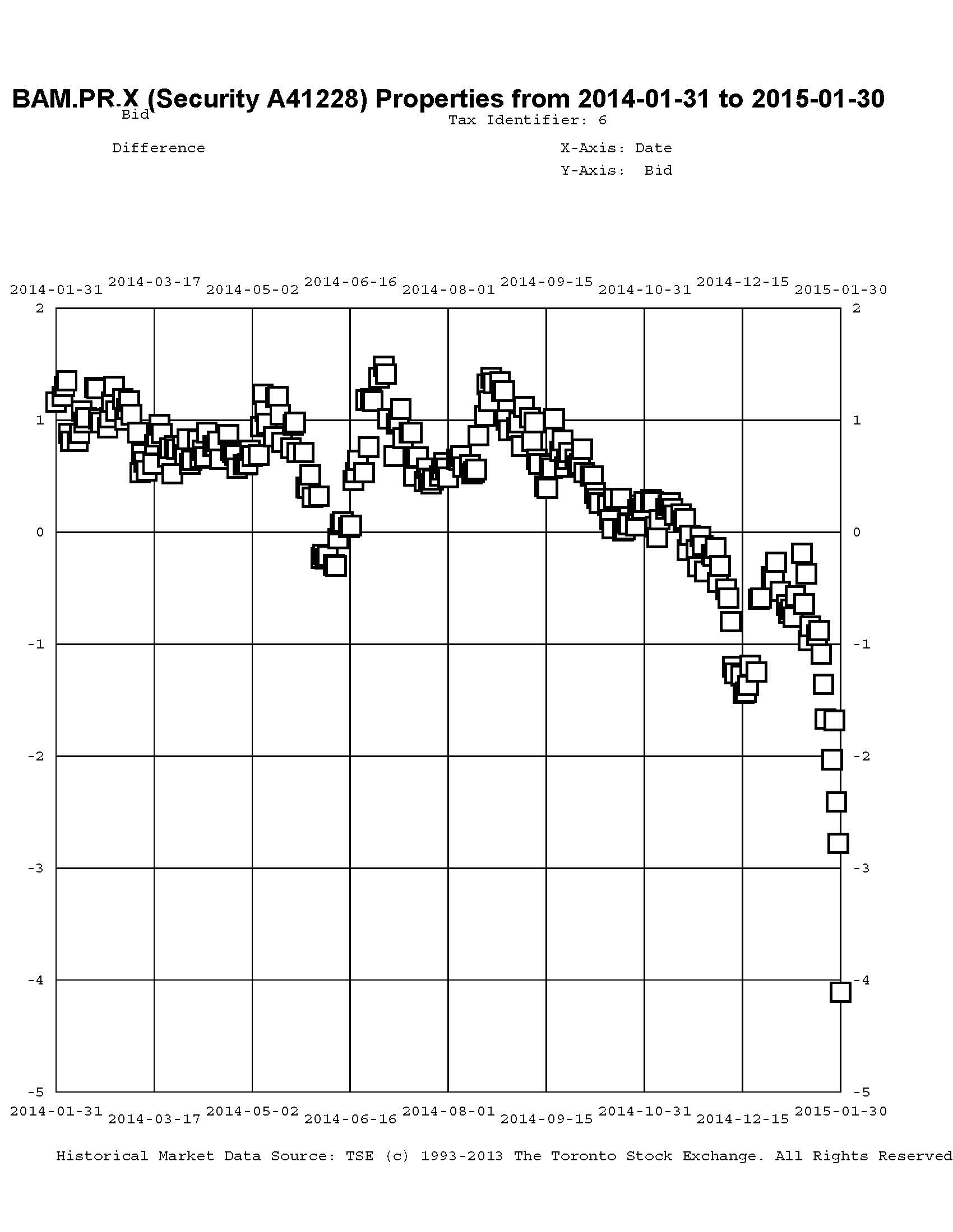
Click for Big
… and FTS.PR.H / FTS.PR.J:
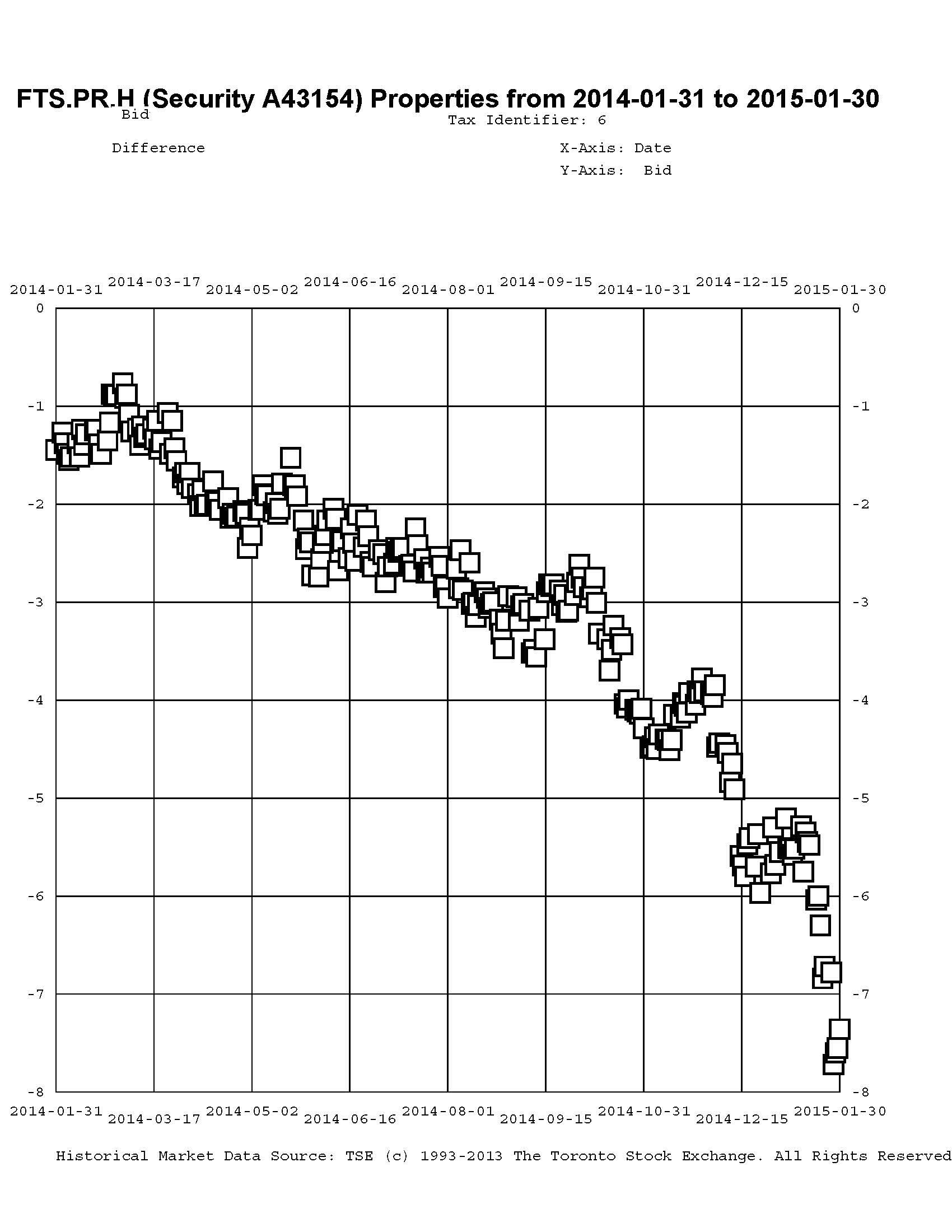
Click for Big
… and PWF.PR.P / PWF.PR.S:
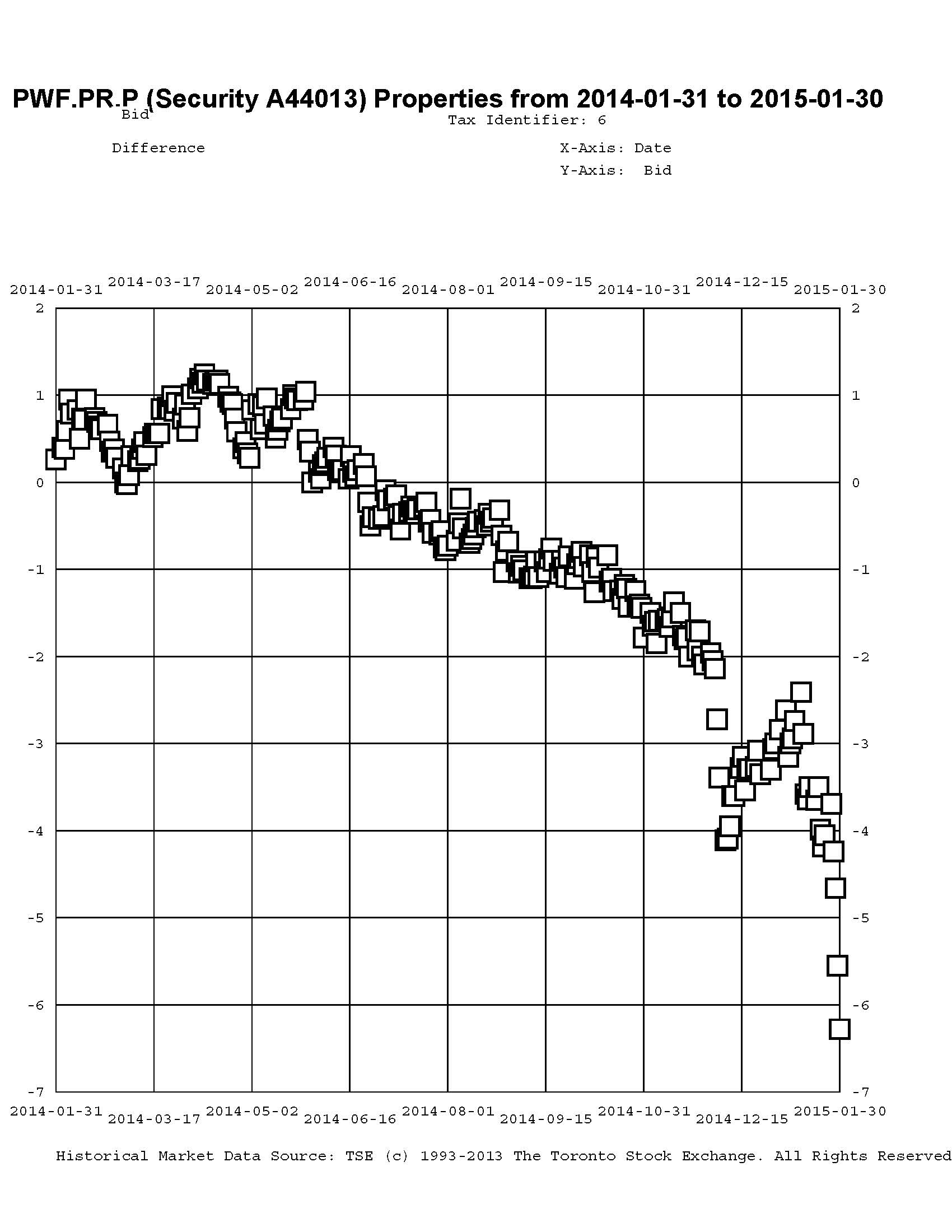
Click for Big
I will agree that the fund’s trades highlighted in this post may be decried as cases of monumental bad timing, but I should point out that in May, 2014, the fund was 63.9% Straight / 9.5% FixedReset
while in January 2015 the fund was 35% Straight / 51% FixedReset & FloatingReset (The latter figures include allocations from those usually grouped as ‘Scraps’). Given that the indices are roughly 30% Straight / 60% FixedReset & FloatingReset, it is apparent that the fund was extremely overweighted in Straights / underweighted in FixedResets in May 2014 and that this qualitative tilt remains, but is no longer extreme.
Summarizing the charts above in tabular form, we see:
| FixedReset | Straight | Take-out December 2013 |
Take-out MAPF Trade |
Take-out December 2014 |
Take-out January 2014 |
| GWO.PR.N 3.65%+130 |
GWO.PR.I 4.5% |
($0.04) | $1.00 | $2.95 | $5.80 |
| SLF.PR.G 4.35%+141 |
SLF.PR.D 4.45% |
($1.29) | $0.25 | $2.16 | $6.12 |
| MFC.PR.F 4.20%+141 |
MFC.PR.C 4.50% |
($1.29) | $0.86 | $1.20 | $5.15 |
| BAM.PR.X 4.60%+180 |
BAM.PR.N 4.75% |
($2.06) | $0.17 | $4.11 | |
| FTS.PR.H 4.25%+145 |
FTS.PR.J 4.75% |
$0.60 | $5.68 | $7.36 | |
| PWF.PR.P 4.40%+160 |
PWF.PR.S 4.80% |
($0.67) | $3.00 | $6.28 | |
| The ‘Take-Out’ is the bid price of the Straight less the bid price of the FixedReset; approximate execution prices are used for the “MAPF Trade” column. Bracketted figures in the ‘Take-Out’ columns indicate a ‘Pay-Up’ | |||||
So why is all this happening? One should take care in explaining market movements, but it is my belief that in the latter half of 2013 we were dealing with the ‘taper tantrum’ – the market’s fears that Fed tapering and subsequent tapering would lead to massive spikes in yields; this led to a great preference for FixedResets over Straights. Now, with the economic news getting less inflationary with every news story and Europe and Japan desperately trying to reflate their sluggish economies, the market seems to think that these rate increases are still a long way off … leading to a great preference for Straights over FixedResets.
In addition, the graphs show a sharp spike in early December, during which the low-spread FixedResets were very badly hurt; I believe this to be due to a combination of tax-loss selling and a panicky response to the 29% reduction in the TRP.PR.A dividend.
And in January it just got worse with Canada yields plummeting after the Bank of Canada rate cut with speculation rife about future cuts.
There was some good discussion about what is going on in the comments to the January 29 market action report. I take the view that we’ve seen this show before: during the Credit Crunch, Floaters got hit extremely badly (to the point at which their fifteen year total return was negative) because (as far as I can make out) their dividend rate was dropping (as it was linked to Prime) while the yields on other perpetual preferred instruments were skyrocketing (due to credit concerns). Thus, at least some investors insisted on getting long term corporate yields from rates based on short-term government policy rates. And it’s happening again!
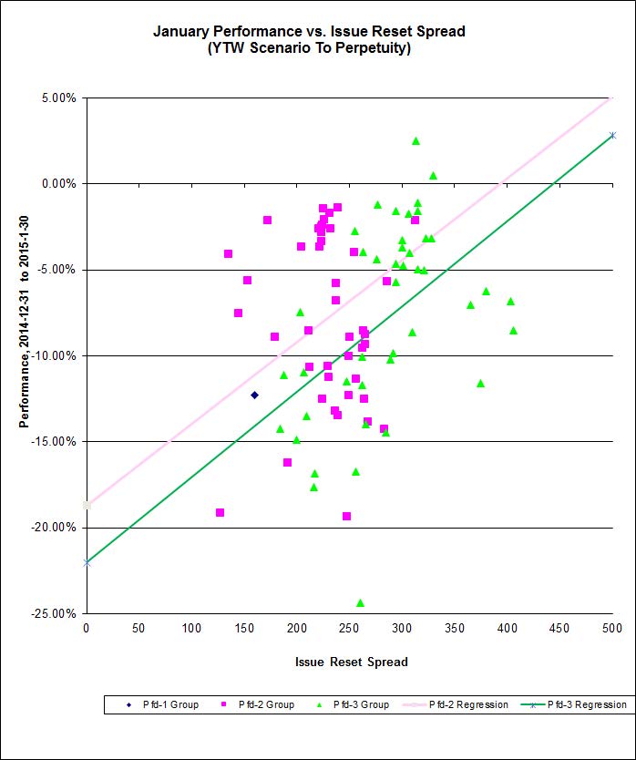
And finally – here’s the January performance for FixedResets that had a YTW Scenario of ‘To Perptuity’ at mid-month. Unusually, the Pfd-3 Group had a better correlation than the Pfd-2 group (20% vs. 11%), but it is striking that the slopes are so similar.:
Click for Big
Hi James,
First of all I’d like to thank you for your very clear (and, as usual, insightful) explanation of the current market turmoil in the comments to the Jan 29 and 30 blogs.
Changing gears a bit, I am quite perplexed as to how you can fit straight lines that make any reasonable sense to the highly scattered data points in the plot just above. I am an experimental physicist by profession, and would have a lot of difficulty justifying applying such fits to data measured in my lab (even if I believed in an underlying theoretical behavior). Am I missing something?
Thanks again for your extremely enlightening and useful PrefBlog postings and, of course, PrefLetter newsletter issues. (Note to other “assiduous readers”: Invaluable newsletter if you are interested in preferred share investing / trading.)
I am an experimental physicist by profession
Geez, all along I’ve figured you were a lawyer! Well, you learn something new every day.
I am quite perplexed as to how you can fit straight lines that make any reasonable sense to the highly scattered data points in the plot just above.
The fits are often better than are shown for this month’s performance, so one way I can justify drawing the lines is that I usually cherry-pick my datasets better than this!
There are a lot of variables left out of the correlation analysis that is shown. For instance, there is no allowance made for time to reset, none for issuer (which may be important when credit concerns come to the fore), none for level of current dividend vs. expected dividend … nothing at all is regressed except the Issue Reset Spread against the month’s total return.
Over such a short period and in such a messy market – and with so many important variables left out! – I think it’s pretty amazing that there’s any correlation at all! According to James F. Hemphill of Simon Fraser University:
… it’s a small correlation, but at least it’s there!
And for practical purposes, I want to show readers – who may be very casual readers of PrefBlog, perhaps it’s just Granny Oakum frantically seeking comment, any comment, on why her preferreds are down so much this month – that there is a relationship, albeit only a weak one for this series this month. And, having drawn a line, I feel honour bound to report the correlation coefficient.
And thanks for the shout-out for PrefLetter!