I don’t, as a rule, like pseudo-analytical notes such as this post. Historical plots implicitly assume that the anything not intrinisic to the plot is constant; and in plotting historical yields there’s an entire economy being ignored which is most emphatically not constant.
But some people like them; I got curious; and Assiduous Readers (after yesterday‘s collapse) will want something cheerful to look at.
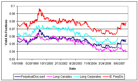
So … without further ado, here’s a plot of yields, going back 10 years. PerpetualDiscount yields are from the HIMIPref™ Index; other yields are courtesy of the Bank of Canada. The graphs get cut off at the end of March, 2008, because that’s the data I have convenient for the HIMIPref™ indices; Long Corporates get cut off in mid-2007, because that’s when the Bank stopped getting bond data with permission to redistribute freely.
… and the Perpetual Discount Interest Equivalent Spread against Long Corporates (using a constant equivalency of 1.4x, which is fishy in the extreme):
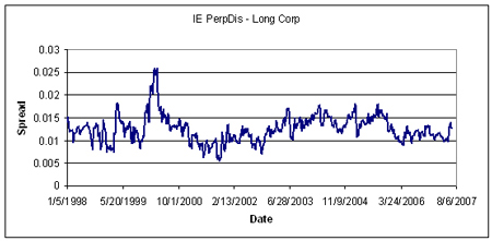
So folks … we’re bloodied but unbowed! Spreads are (roughly) near a ten year high … recall my note of yesterday that PerpetualDiscounts now have an average yield of 6.00%; interest-equivalent (at 1.4x) of 8.40%; vs. Long Corporates of just under 6.2%.